Data Visualizations
In the world of user experience (UX) research and design, stakeholder buy-in is crucial for success, though it is often a point of contention for practitioners who aim to prioritize UX in their organization. Without the support of stakeholders, UX research can be seen as a low-priority expense, and design changes may be met with skepticism or even resistance. To a UX practitioner, this can be a frustrating experience, given that there is no shortage of evidence supporting the fact that UX research has a substantial impact on the success of business. Deloitte, for example, found that companies that prioritize customer experience (CX) generate 60% higher profits than their competitors. Similarly, companies that focus on customer experience have a 5.7x higher return on investment (ROI) than those that don’t, according to Forrester, while Qualtrics also found that companies that prioritize customer experience are 4.5x more likely to have high customer retention rates. Despite the data, and the ongoing demand for more user-friendly products across the world, those in UX design and research continue to be met with a large list of reasons why there is a lack of stakeholder engagement, with some of the most apparent reasons being:
- Lack of Understanding: Stakeholders may not fully understand the value of UX research and its impact on the overall success of a product or service. This lack of understanding can lead to resistance to investing time and resources in UX research.
- Limited Budget: Stakeholders may be unwilling to allocate sufficient budget and resources for UX research, which can limit the scope and depth of the research that can be conducted.
- Lack of Communication: Stakeholders and UX researchers may not communicate the value of UX in a way that relates or connects stakeholders to research. This leads to misunderstandings and missed opportunities for collaboration. This can also lead to stakeholders feeling disconnected from the UX research process and less likely to buy into the findings and recommendations.
Ultimately, these issues, alongside many others, have a direct impact on user satisfaction, user dependency and user-engagement with a product of service. In some cases, lack of stakeholder engagement may very well lead to products or services becoming “obsolete” or outdated, especially in the digitally-dominated world we currently live in! Quite frankly, without stakeholder buy-in, products and services do not serve users on an optimal level. For this reason, stakeholder engagement represents a tipping point between stakeholders, UX practitioners and users, with the unfortunate “loser” being the most important party – the user. To make matters wrose, If stakeholders don’t see value in serving their users on the most basic levels, imagine the negative impacts it may have on users with accessibility needs and diverse global audiences! “Horrific”, becomes the only word that comes to mind in this case.
The Buy-In Approach

Oftentimes, the importance of involving stakeholders in the research process is often cited as a crucial step in improving stakeholder buy-in with UX. This of course is vital, however, simply providing recordings from moderated interviews, or providing written up reports from UX insight is not enough. Just because there are insights to be found, does not mean that they are obvious, nor does it mean that they actually make sense to a stakeholder! This is precisely where data visualization comes in.
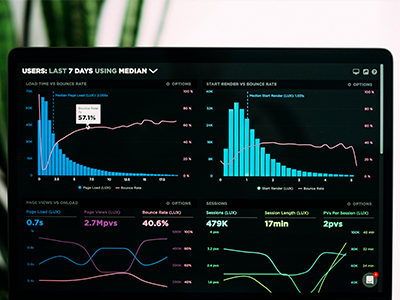
When harnessed correctly, data visualization brings data to life by demonstrating a wider-range of insight, in a meaningful yet easy-to-digest format. In this instance, we are not just talking about written descriptions that explain visualized data, or just relying on pie charts and graphs. Rather we are talking about how the data is actually presented to stakeholders. The old adage, a picture is worth a thousand words may not have come from someone who was looking at a well-designed table graph or pie chart, though no truer words could be spoken in explaining the power of data-visualization through the lens of storytelling,
The Secret Sauce

Regardless if we are discussing a Disney movie plot or a pie chart, storytelling has always been a powerful way to create a connection between an audience and content. When viewers can follow a narrative with a clear beginning, middle and end, the information becomes more memorable, as well as more meaningful. Take for example a customer journey map,which actually takes the stakeholder through the real walkthrough of a user experience, bringing key pain points to the forefront. If stakeholders can clearly understand their users frustrations and satisfactions, they thus can understand why ux research would be necessary. However, the power of storytelling does not stop there. Consequently, data visualization can actually help to increase empathy and understanding among stakeholders. By presenting data in a way that highlights the challenges and frustrations that users may be experiencing, stakeholders can develop a deeper appreciation for the importance of UX research and design changes. Afterall, empathy is a foundational component in UX research. So why not develop this skill set in your stakeholders?!
Visualizing comparative data is another powerful way to bridge storytelling and stakeholder buy-in, and by extension allow stakeholders to learn how UX research is directly tied to their business objectives or ROI. For example, By visualizing data on user behavior before and after implementing UX changes, stakeholders can see the measurable impact of those changes in a simplified manner (ie ratings scores, time on tasks, task completion). Similarly, a heat map showing where users clicked before and after redesigning a website can demonstrate how the new design is more effective at directing user attention to important elements. This would clearly demonstrate why users have missed prior CTA’s, or overlooked key product information on a website! Similarly, A/B testing between an old and new version of an asset helps tell the story of “ what is”. to “what could be”! If the data is well visualized, and demonstrates that a change improves user performance and satisfaction, stakeholders are not only able to make more informed decisions, they also can clearly understand why ux research and design influence the productivity of their organization. Through this tactic alone, storytelling will help stakeholders understand what their users need or prefer and what would need to change to meet those needs.
Tips for Storytelling with Data

Storytelling through data is easier said than done. So, lets cover some important steps to keep in mind to help ensure your stakeholders understand the value of UX Research
Data Visualizations, Data Visualizations, Data Visualizations,
- Define Before Building: Before starting to create your visualization, it’s important to have a clear understanding of the story you want to tell and who your audience is. Think about the main message you want to convey and what data will support that message. Consider the level of detail your audience needs and how much context you’ll need to provide. To determine the message or story, you need to begin by understanding your stakeholder group and what they care about. For example, if your stakeholders are executives, they may be most concerned with how user experience research and design changes will impact the bottom line. If your stakeholders are product managers, they may be more interested in specific user needs and pain points that the research has identified. Once you have a clear understanding of your stakeholder group’s interests, you can then identify the key message that will resonate with them. This message should be simple, clear, and easy to understand. It should highlight the most important insights that the research has uncovered and how those insights can be used to inform UX design changes.
- Choose Visuals Carefully: Choosing the right data visualization type is crucial to effectively communicate your message to stakeholders. For example, if you want to show how users move through a website or app, a user journey map could be the best option. If you want to highlight patterns or trends in user behavior, a line graph or bar chart could be more appropriate. Some types of data are better suited for visual representation through graphs, while others are better suited for charts. For example, if you have data that involves percentages or proportions, a pie chart or bar chart might be more appropriate. On the other hand, if you have time-series data, a line graph might be more effective.Consider the stakeholder group’s preferences and needs when selecting a visualization type. If your stakeholders are more visually oriented, consider a more complex visualization type like an interactive dashboard or heat map. On the other hand, if your stakeholders prefer simplicity and clarity, a basic bar chart or pie chart could be a better choice.
- Use Visual Cues: When it comes to data visualization, it’s not just about presenting data in a clear and concise way. It’s also about telling a story that stakeholders can easily understand and connect with. Visual cues can take many forms, including color, size, and shape. For example, using a color gradient to show changes in data over time can be an effective way to tell a story. The gradient can be used to show changes in customer satisfaction over time (red indicating lower satisfaction and green indicating higher satisfaction.) This can help stakeholders easily see how UX design changes have impacted user experience. By varying the size of data points, such as circles or squares, you can draw attention to important data and convey its relative importance. For instance, if you are creating a scatter plot of customer satisfaction data, you could make the size of the data points correlate with the number of customers who reported that particular satisfaction level. This could help stakeholders quickly see where the majority of customers fall in terms of satisfaction, and which areas may require further attention.
Finally, shape can also be used to tell a story. For instance, if you are comparing two different sets of data, you could use different shapes to represent each set. This would make it easy for stakeholders to see how the data sets compare to one another, and quickly identify any patterns or trends.
- Use a Narrative Structure: A narrative structure can effectively incorporate storytelling into data visualization, creating a logical flow and guiding the audience through the information presented. This structured approach can make data more compelling and easier to understand, leading to better stakeholder buy-in for UX research. To use a narrative structure, start with a clear and concise introduction that provides context for the research topic. Move into the main part of the visualization, where research findings and evidence are presented in a well-organized and easy-to-follow manner. Use headings and subheadings to help guide the audience through the information.Finally, conclude with a summary or call to action that emphasizes the key points and leaves a lasting impression on the audience. This can be an opportunity to provide recommendations or suggest next steps for stakeholders. By using a narrative structure, UX researchers can make their research more engaging and persuasive. A well-structured narrative can provide context, emphasize key points, and leave a lasting impact on the audience, ultimately improving stakeholder engagement and support for UX research.
Data Visualizations
Conclusion
Simply put, we should not make the mistake of thinking that engaging stakeholders in the UX researcher process is enough, nor is it effective to just provide data or insights in hopes of creating a connection between business objectives and UX research. We have to actually build that connection through the story we tell. Specifically, how we tell, and to whom we are telling the story too. Storytelling is persuasive. It’s impactful, easy to follow, and adds the right amount of simplicity to the messages we are trying to convey. When harnessed correctly, it has the power to teach empathy to viewers, which is evident in the countless endearing stories that have impacted people around the world through movies, art, commercials and picture books. By weaving data and insights into a compelling narrative, UX researchers can increase stakeholder buy-in and create a shared understanding of the user experience. Remember to choose the right visualization techniques and to keep the end-user in mind throughout the process. With these tips in mind, UX researchers can make their findings more accessible and actionable, and ensure that they are able to make a real impact on the design process.
Interested in UX Testing?
Data Visualizations
About the Author: Nicholas Aramouni

Nicholas Aramouni is a Senior UX Researcher and Communications Manager who has developed his qualitative and quantitative knowledge by working within a variety of industries, including music entertainment, media, technology and education. Across his career, Nick has conducted numerous international studies in countries all around the globe, placing importance on developing international partnerships as a means of better understanding the various cultures and markets that push UX researchers further. Nicholas has enhanced his involvement in UX by also working as a marketing content strategist and speaker in the field. He has proudly completed a B.A in Policy Studies, a minor in Business Innovation and a B.A in Education.
Read More Articles by Nicholas


