
If you visited a complex website and found everything you were looking for with ease, it was unlikely a coincidence. A well-designed website structure is often the result of careful user research and testing, following information architecture principles and best practices.
So what is information architecture (IA), and how is it applied to websites? Below, we’ll discuss a set of principles to think about and the steps you can take to design a solid IA for any world wide web site.
What is Information Architecture?
Information Architecture is the art and science of structuring content clearly and understandably. The goal of IA is to enable users to find what they need with ease. Designing the IA of a website involves arranging content pieces in a way that considers their relations to each other, user goals, and user context.

As with other parts of the UX umbrella, IA can be applied in a redesign or when developing a product from scratch.
Why is Information Architecture Important for Your Website?
Information architecture is crucial for a website for several reasons:
Organization and structure
Information architecture helps in organizing and structuring the content of a website in a logical and intuitive manner. It involves designing the overall navigation, categorization, and hierarchy of information, which makes it easier for users to find what they are looking for. A well-organized website enhances user experience, reduces frustration, and increases the chances of visitors staying longer on the site.
User-friendly navigation
Effective information architecture ensures that the navigation system of a website is user-friendly and intuitive. Users should be able to easily understand where they are within the site, how to move between different sections, and how to access the desired information or functionality. Clear and well-designed navigation enhances usability, reduces bounce rates, and encourages visitors to explore more pages.
Findability and searchability
Information architecture helps in improving the findability and searchability of content on a website. By structuring information into meaningful categories and organizing it with clear labels, users can quickly locate the information they need. Additionally, a well-designed information architecture can enhance the performance of search functionality, making it easier for users to search for specific content or products within the site.
Scalability and flexibility
Proper information architecture allows a website to scale and adapt to changing needs over time. As the content and features of a website grow, a well-structured architecture ensures that new elements can be seamlessly integrated without disrupting the overall user experience. It allows for easy updates, additions, and modifications to the site, reducing maintenance costs and efforts.
SEO and content strategy
Information architecture plays a significant role in search engine optimization (SEO) and content strategy. When the information on a website is organized and categorized in a logical manner, search engines can better understand the site’s structure and content. This can improve the site’s visibility in search engine results and increase organic traffic. Additionally, a well-planned information architecture facilitates the creation of targeted and relevant content, aligning with user needs and improving SEO efforts.
What are the Consequences of Poor Information Architecture?
A poor website structure can have several negative consequences for a website. Here’s a lis of the most critical.
User Frustration: Bad IA can lead to user frustration and confusion. If information is poorly organized or difficult to find, users may struggle to navigate the site and locate the content they need. This can result in a poor user experience, increased bounce rates, and decreased engagement.
Increased Cognitive Load: When the IA lacks clarity and coherence, users have to invest more mental effort to understand the structure and locate information. High cognitive load can lead to cognitive overload, decision fatigue, and a sense of overwhelm, making it harder for users to achieve their goals efficiently.
Reduced Findability: A poorly organized IA can make it challenging for users to find the specific information or functionality they are seeking. If search functionality is ineffective or the navigation system is confusing, users may abandon their search or resort to external search engines, diminishing the website’s value.
Decreased User Trust: Users may perceive a poorly structured IA as a lack of professionalism or credibility. If they are unable to locate important information or if the site feels disorganized, they may question the reliability and trustworthiness of the website, potentially impacting their willingness to engage or convert.
Negative Impact on SEO: Search engine optimization (SEO) relies on well-structured and organized content. A poorly implemented IA can lead to content duplication, inconsistent labeling, and ineffective keyword targeting, negatively impacting the website’s search engine rankings and visibility.
Decreased Conversion Rates: A confusing or convoluted IA can hinder users’ ability to complete desired actions, such as making a purchase, signing up for a service, or submitting a form. If users struggle to find the necessary information or encounter obstacles during the conversion process, it can lead to lower conversion rates.
Maintenance Challenges: Poor IA can make website maintenance more challenging and time-consuming. Without a clear and organized structure, updating or adding new content becomes more complicated, potentially leading to inconsistencies, broken links, and difficulties in scaling or expanding the website.
To mitigate these consequences, it is crucial to invest in thoughtful information architecture design that prioritizes user needs, clear organization, and intuitive navigation. Conducting user research, usability testing, and incorporating best practices in IA can greatly improve the user experience and the overall success of a website.
The Principles of Information Architecture

Before diving into the process of building the IA, it’s best to start with a set of principles for guidance. A frequently referenced source for guiding the IA process is Dan Brown’s 8 principles:
1. Principle of objects
The principle of objects means that content is dynamic and unique. Each object has a lifecycle, behaviors, and attributes. Based on this concept, you can archive or recategorize pages of retired products that have been already removed.
Reorganizing and structuring new content under this principle requires identifying the type of content you are going to use. Whether videos, blog posts, or infographics, determining the type will help you identify the best way to structure it.
2. Principle of choices
The principle of choices emphasizes providing users with meaningful and relevant choices to navigate and interact with information systems or interfaces. It involves designing structures, pathways, and interfaces that offer users clear options and pathways to access content, complete tasks, and accomplish their goals.
This principle recognizes that different users have varying preferences, needs, and objectives when interacting with information. By offering well-defined and purposeful choices, information architects empower users to navigate through complex information spaces in a way that aligns with their individual preferences and goals.
Users should be presented with a few, trully meaningful options. You must create pages that provide users with options that are relevant to them while keeping the options’ range task-focused.
In fact, offering too many options is usually worse than too few as they can overwhelm and prevent the user from . Keep the range of choices focused on a particular task. Too many options can delay decision-making. For example,
3. Principle of disclosure
the principle of disclosure refers to the concept of progressively revealing information to users based on their needs, context, and level of engagement. It involves structuring and presenting information in a way that allows users to access relevant details as they navigate through a system or interface.
The principle of disclosure recognizes that overwhelming users with excessive information all at once can lead to cognitive overload and hinder their ability to find what they need. Instead, information should be presented in a hierarchical and layered manner, with the most important and relevant content being readily available, while additional details are made accessible as users delve deeper or express specific interests.
By employing the principle of disclosure, information architects aim to create user-friendly experiences that balance discoverability and simplicity.
This involves considering factors such as user goals, information complexity, context, and the progressive nature of user interactions. Providing clear navigation, categorization, and appropriate signposting helps users uncover relevant information gradually, without overwhelming them.
For example, a website might have a homepage with high-level information and links to major sections. As users navigate deeper into specific sections, they encounter more detailed content, subcategories, or interactive elements that further reveal information based on their choices or interactions.
4. Principle of exemplars
The principle of exemplars in information architecture refers to the concept of using concrete and representative examples to illustrate and guide users in understanding the content, structure, and functionality of an information system or interface.
It involves presenting real or prototypical instances of information or tasks to help users grasp the overall organization and capabilities of a system.
The principle of exemplars recognizes that users often benefit from seeing specific examples that demonstrate how information is organized, how tasks are performed, or how content is presented within a system.
By showcasing exemplars, information architects provide users with tangible references that aid in their comprehension and navigation of the system.
5. Principle of front doors
The principle of front doors states that a website has multiple doors for users to arrive through -product pages, blog posts, or any other landing page. Home can be the main gate, but at least half of a website’s visitors will come through another page.
In this regard, it is essential to offer visitors clues and navigational aids as to where they are in the whole website. This will help them clarify where to go from that starting point. Both the footer nad the header offer critical navigational clues as they contain headlines, company or product descriptions, etc.
From there, users can access several other sections and anding pages, and will immediately know where they are -this is a critical element of web UX.
6. Principle of multiple classifications
The principle of multiple classifications in information architecture emphasizes the idea of assigning multiple categories or classifications to information items within a system or interface.
It recognizes that different users may have different mental models, perspectives, or ways of conceptualizing information. By providing multiple paths for users to access and navigate information, the principle of multiple classifications enhances findability and accommodates diverse user needs.
Some key aspects of the principle of multiple classifications include:
Cross-referencing: Information items are assigned to multiple categories or classifications, allowing users to access them through different pathways. This enables users to locate information from different entry points based on their preferred approach or mental model.
Faceted classification: Information items are tagged or categorized using multiple facets or attributes. Users can then explore information by combining or filtering facets, narrowing down their search based on specific criteria or perspectives.
Hierarchical organization: Information is structured in a hierarchical manner, with items appearing in multiple levels or categories within the hierarchy. This allows users to access information from different levels, enabling both broad and specific navigation paths.
Tagging and metadata: Tagging content with descriptive keywords or metadata allows for multiple associations and classifications. Users can then search, filter, or browse information based on these tags, finding relevant content regardless of its primary category.
User-driven organization: Allowing users to create their own classifications or organize information according to their needs provides a personalized and flexible approach. User-generated tags, bookmarks, or custom folders enable individuals to categorize information based on their unique perspectives.
The principle of multiple classifications in information architecture acknowledges that users have diverse cognitive structures and information-seeking behaviors.
By incorporating multiple categories, classifications, and navigation options, designers enhance the findability, flexibility, and user-friendliness of the information system or interface.
7. Principle of focused navigation
The principle of focused navigation in information architecture emphasizes providing users with clear and concise navigation options that are directly relevant to their current context or goals.
It aims to streamline the navigation experience by minimizing distractions and presenting users with the most pertinent choices to help them find the information or complete the tasks they need.
One key aspect of the principle of focused navigation is contextual relevance: The navigation options presented to users should align closely with their current context, location, or specific goals. This ensures that users are provided with choices that are directly related to their immediate needs, reducing cognitive load and facilitating efficient navigation.
It’s also importanto to give users clear and concise options. Navigation menus or pathways should be designed in a clear and concise manner, using descriptive and easily understandable labels. By avoiding ambiguity and excessive options, users can quickly identify and select the most appropriate navigation paths.
8. Principle of growth
The principle of growth in information architecture pertains to designing information systems or interfaces in a way that accommodates future expansion, scalability, and evolving user needs.
It involves anticipating and preparing for future growth, ensuring that the architecture can adapt and accommodate additional content, features, or functionality as the system evolves.
The Essential Guidelines of Information Architecture

Information architecture also relies on guidelines for organizing and structuring information within a digital environment. Here are some commonly recognized IA guidelines that help UX designers achieve the best usability and experience.
Target organization
Create a clear and logical structure for information. Group related content together and establish meaningful categories or hierarchies.
Look for navigation
Design intuitive navigation systems that help users easily find and move between different sections of a website or application. Use consistent labeling and placement of navigation elements.
Boost findability
Ensure that users can quickly locate the information they need. Utilize a search bar, clear labels, and descriptive metadata to enhance findability.
Secure consistency
Maintain consistency in the organization, labeling, and design of information across different sections of the website or application. Consistency promotes familiarity, reduces cognitive load, and improves user experience.
Thrive for clarity
Present information in a clear and understandable manner. Use concise and meaningful language, avoid jargon or technical terms whenever possible, and provide contextual explanations when needed.
Think of scalability
Design the information architecture to accommodate future growth and changes. Plan for the addition of new content, features, or functionalities without disrupting the overall structure or user experience.
Follow accessibility
Ensure that the information is accessible to users of different abilities. Follow accessibility guidelines to make the content perceivable, operable, understandable, and robust.
Focus on user-centricity
Put the needs and goals of the users at the center of the information architecture design. Consider user research, usability testing, and feedback to create an IA that aligns with user expectations and behavior.
These principles serve as guidelines to create effective information architectures that enhance usability, navigation, and findability, resulting in a positive user experience.
How to create Information Architecture for web design?
There are several steps you need to take to succesfully implement information architecture.
1. Define your goals
The goal of IA is to help users find what they need with ease, but what does that mean for your website? You should work with all key stakeholders and ask:
- What need do you want to satisfy?
- Why do you want to do this?
- What do you hope to achieve with it?
2. Understand your Users
You need to know who your users are. Conduct user research, develop personas and create scenarios. This should help you answer:
- What are these users’ goals?
- What will they do on the website to achieve them?
Gather insights about the target audience through user research methods such as surveys, user interviews, or usability testing. Identify user needs, preferences, and expectations regarding content organization and navigation.
Create user personas, representing typical users, to guide your design decisions. Develop user scenarios that illustrate their goals, tasks, and information needs. This helps in tailoring the information architecture to user requirements.
Your personas and scenarios should tell a story that you can share with stakeholders. Think about any constraints users may have that can lead to a worst-case scenario, and how you can prevent that.
This is also a good time to think about competitors and how they meet their users’ needs. Visit their websites and explore their information architecture, thinking of the perspective your personas would have. Refer to the IA principles and ask whether they are being met and if they are not, what they could change to improve the IA?
3. Outline your content
If your website is new, you get to start from scratch and plan out the content. If your website already has content, create a list of all pages, media, and downloadable content. Make notes on each piece, such as its accuracy, relevance, and classification. If anything is not useful, get rid of it.
Take stock of the existing content and determine its relevance and suitability for the new website. Identify gaps, redundancies, or outdated information. This step helps you understand the content landscape and inform the organization.
4. Use card sorting to classify and group content

Now that you have a list of all relevant content, classify and categorize it. Card sorting is a participatory design technique that can help you do this.
You start by creating a card for each piece of content, which should at the very least have a printed title, but could also list features or concepts. You then give these cards to users and ask them to sort them into groups.
Userlytics offers card sorting capabilities, which can be used in either unmoderated or moderated remote usability tests. Once you’ve done card-sorting with a set of users, you can refine your results into a sitemap and menu navigation.
5. Define Information Categories and Structure
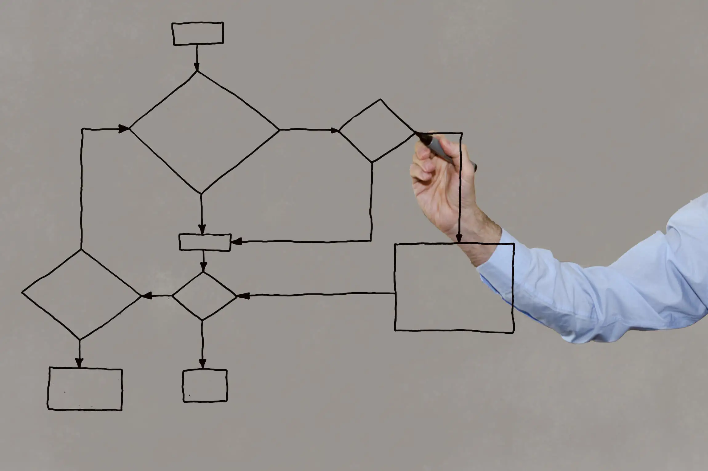
Based on user research and content inventory, determine the main information categories and how they relate to each other. Consider creating a visual sitemap or hierarchical diagram to outline the structure and relationships between different sections.
A sitemap is a grouped and labeled visual representation of your content.
6. Plan navigation
Design an intuitive navigation system that allows users to move through the website easily. Consider various navigation patterns, such as top-level menus, dropdowns, sidebars, or breadcrumbs. Ensure the navigation labels are clear and descriptive.
Navigation is a collection of all user-interface elements that house your content, which should be connected in meaningful ways.

5. Conduct tree tests on the navigation
Tree testing is a quantitative method used to determine what paths people will take through the IA to find key information. Participants navigate the website’s navigation using link names only, which are organized into a hierarchy of topics and subtopics.
This method helps determine if names and categories convey the contents correctly. The goal is to have titles that are distinguishable from one another, and users do not have to backtrack to find what they need. You can use Userlytics’ tree testing capabilities to build and test your navigation in remote usability tests.

6. Usability test as the website develops
So far, you’ve tested your information architecture stripped to its essential features. You will need to verify whether the IA you developed is suitable for the actual website as it is developing. This means user testing the information architecture at each iteration of the website’s prototype based on data models, as well as significant developments for the live website.
Usability testing is a qualitative technique where users are often given some tasks to complete, as the researcher observes and takes notes. It can reveal how users find information, how they interpret content and what they ignore or refuse to use, and why. mind mapping, mind mapping, main page, ux design
This method is most effective in combination with a short semi-structured interview at the end. An interview will give you insights into what they felt about the tasks, and their overall experience with the website.
Information architecture, like most design work, is never truly done. Your website will grow and shrink as your product or company changes. No matter how much a company or website may grow and change, you can always maintain a simple and understandable information architecture.
Design an intuitive navigation system that allows users to move through the website easily. Consider various navigation patterns, such as top-level menus, dropdowns, sidebars, or breadcrumbs. Ensure the navigation labels are clear and descriptive.
Interested in UX Testing?
Data Visualizations
Article written by Paul Khawaja
About the Author: Collaborations

Our blog collaborators are a diverse group of professionals with extensive knowledge and experience in the field of user experience. They include UX researchers, designers, thought leaders, and industry professionals who are passionate about sharing their insights and expertise with others.
As collaborators, they contribute thoughtful and inspiring content that covers various aspects of the UX space, including emerging trends, best practices, and practical tips. Their articles are designed to help readers stay up-to-date with the latest developments in UX, as well as improve their own skills and knowledge in the field.
Read More Articles by Our Collaborators